CSS Normalize/Reset for WordPress
While working through the process of optimizing my themes for the newer default WordPress Editor, I noticed some issues when using the CSS Reset that I’ve used and shared in a previous post. I will cover the key steps in that process in a later post, but one of the main aspects was updating my reset method to be less heavy-handed with the newer post blocks. The reset below combines parts of Normalize.css and my previous reset, without totally zeroing out all elements, and as before, it makes form elements and media items responsive.
This is my current CSS Normalize/Reset for WordPress.
html {
	box-sizing: border-box;
	font-family: system-ui, sans-serif;
	line-height: 1.25;
	-webkit-text-size-adjust: 100%;
	-webkit-tap-highlight-color: transparent;
}
*,
*:before,
*:after {
	box-sizing: inherit;
}
body {
	margin: 0;
}
h1 {
	font-size: 2em;
	margin: 0.67em 0;
}
hr {
	box-sizing: content-box;
	height: 0;
}
pre,
code {
	font-family: monospace, monospace;
	font-size: 0.937em;
}
pre {
	tab-size: 4;
	overflow: auto;
}
strong,
b {
	font-weight: 700;
}
blockquote,
q {
	font-style: italic;
}
ol,
ul {
	list-style: none;
	padding: 0;
	margin: 0;
}
sub,
sup {
	font-size: 0.75em;
	line-height: 0;
	position: relative;
	vertical-align: baseline;
}
sub {
	bottom: -0.25em;
}
sup {
	top: -0.5em;
}
table {
	border-collapse: collapse;
	border-spacing: 0;
}
th,
td {
	border: 1px solid;
	padding: 0.25em;
}
button,
input,
optgroup,
select,
textarea {
	font-family: inherit;
	font-size: 1em;
	line-height: inherit;
	margin: 0;
}
button,
input,
textarea {
	background-color: inherit;
	color: inherit;
	border: 1px solid;
	border-radius: 0;
	outline: 0;
	padding: 0.25em;
	max-width: 100%;
	-webkit-appearance: none;
	-moz-appearance: none;
}
button,
select {
	text-transform: none;
}
::-webkit-search-decoration,
::-webkit-search-cancel-button {
	-webkit-appearance: none;
}
progress {
	vertical-align: baseline;
}
summary {
	display: list-item;
}
blockquote,
figure {
	margin-left: 0;
	margin-right: 0;
}
details,
audio,
img,
video {
	display: block;
}
img,
video {
	height: auto;
	max-width: 100%;
}
embed,
iframe,
object {
	max-width: 100%;
}
.alignleft {
	float: left;
	margin: 0 1em 1em 0;
}
.alignright {
	float: right;
	margin: 0 0 1em 1em;
}
.aligncenter {
	clear: both;
	display: block;
	margin-left: auto;
	margin-right: auto;
}
.clear {
	clear: both;
}
.screen-reader-text {
	border: 0;
	clip: rect(1px, 1px, 1px, 1px);
	-webkit-clip-path: inset(50%);
	clip-path: inset(50%);
	height: 1px;
	margin: -1px !important;
	overflow: hidden;
	padding: 0;
	position: absolute !important;
	width: 1px !important;
	word-wrap: normal !important;
}
.bypostauthor{}
.gallery-caption{}
.sticky{}
.wp-caption-text{}
.wp-caption{}
This is a minified version of the code above.
html{box-sizing:border-box;font-family:system-ui,sans-serif;line-height:1.25;-webkit-text-size-adjust:100%;-webkit-tap-highlight-color:transparent}*,*:before,*:after{box-sizing:inherit}body{margin:0}h1{font-size:2em;margin:.67em 0}hr{box-sizing:content-box;height:0}pre,code{font-family:monospace,monospace;font-size:.937em}pre{tab-size:4;overflow:auto}strong,b{font-weight:700}blockquote,q{font-style:italic}ol,ul{list-style:none;padding:0;margin:0}sub,sup{font-size:.75em;line-height:0;position:relative;vertical-align:baseline}sub{bottom:-.25em}sup{top:-.5em}table{border-collapse:collapse;border-spacing:0}th,td{border:1px solid;padding:.25em}button,input,optgroup,select,textarea{font-family:inherit;font-size:1em;line-height:inherit;margin:0}button,input,textarea{background-color:inherit;color:inherit;border:1px solid;border-radius:0;outline:0;padding:.25em;max-width:100%;-webkit-appearance:none;-moz-appearance:none}button,select{text-transform:none}::-webkit-search-decoration,::-webkit-search-cancel-button{-webkit-appearance:none}progress{vertical-align:baseline}summary{display:list-item}blockquote,figure{margin-left:0;margin-right:0}details,audio,img,video{display:block}img,video{height:auto;max-width:100%}embed,iframe,object{max-width:100%}.alignleft{float:left;margin:0 1em 1em 0}.alignright{float:right;margin:0 0 1em 1em}.aligncenter{clear:both;display:block;margin-left:auto;margin-right:auto}.clear{clear:both}.screen-reader-text{border:0;clip:rect(1px,1px,1px,1px);-webkit-clip-path:inset(50%);clip-path:inset(50%);height:1px;margin:-1px!important;overflow:hidden;padding:0;position:absolute!important;width:1px!important;word-wrap:normal!important}.bypostauthor{}.gallery-caption{}.sticky{}.wp-caption-text{}.wp-caption{}Adding Widgets to the Footer in WordPress
Widgets are great for adding dynamic content to WordPress sites like Recent Posts, Archives, Custom HTML, etc. The method below adds three widgets to the site’s footer area. The widgets stack on top of each other when the viewport is less than 769px wide, then at 769px or wider, they divide into three equal width columns. They also only affect the layout if one or more widgets are active.
Start by adding this to the theme’s functions.php file.
<?php
function emit_widgets_init() {
	register_sidebar( array(
		'name'          => esc_html__( 'Footer 1', 'emit' ),
		'id'            => 'footer-1',
		'description'   => esc_html__( 'Add widgets here.', 'emit' ),
		'before_widget' => '<div id="%1$s" class="widget widget-1 %2$s">',
		'after_widget'  => '</div>',
		'before_title'  => '<h4 class="widget-title">',
		'after_title'   => '</h4>',
	) );
	register_sidebar( array(
		'name'          => esc_html__( 'Footer 2', 'emit' ),
		'id'            => 'footer-2',
		'description'   => esc_html__( 'Add widgets here.', 'emit' ),
		'before_widget' => '<div id="%1$s" class="widget widget-2 %2$s">',
		'after_widget'  => '</div>',
		'before_title'  => '<h4 class="widget-title">',
		'after_title'   => '</h4>',
	) );
	register_sidebar( array(
		'name'          => esc_html__( 'Footer 3', 'emit' ),
		'id'            => 'footer-3',
		'description'   => esc_html__( 'Add widgets here.', 'emit' ),
		'before_widget' => '<div id="%1$s" class="widget widget-3 %2$s">',
		'after_widget'  => '</div>',
		'before_title'  => '<h4 class="widget-title">',
		'after_title'   => '</h4>',
	) );
}
add_action( 'widgets_init', 'emit_widgets_init' );
Then add this to the theme’s footer.php file.
<div id="footer-widgets">
	<?php
	if( is_active_sidebar( 'footer-1' ) ) {
		dynamic_sidebar( 'footer-1' );
	}
	if( is_active_sidebar( 'footer-2' ) ) {
		dynamic_sidebar( 'footer-2' );
	}
	if( is_active_sidebar( 'footer-3' ) ) {
		dynamic_sidebar( 'footer-3' );
	}
	?>
</div>
<div class="clear"></div>
Finally, add the CSS below to the theme’s existing stylesheet.
@media (min-width: 769px) {
	.widget-1,
	.widget-2 {
		float: left;
		width: 30%;
		margin-right: 5%;
	}
	.widget-3 {
		float: left;
		width: 30%;
	}
}
.clear {
	clear: both;
}Get the First or Featured Image URL in WordPress
In a previous post I covered how to get the first or Featured Image in WordPress for displaying the image, but sometimes just the image URL is needed for Open Graph and Twitter Card header tags, etc. The method below first checks for a Featured Image, then for the first attached image, and finally a default image if needed. This also allows you to designate the size (thumbnail, medium, large or full), and it outputs the image URL without the img tag and associated image attributes.
<?php
function evo_thumbnail_image_url() {
	if ( has_post_thumbnail() ) {
		the_post_thumbnail_url( 'large' );
	} else {
		global $post;
		$args = array(
			'post_type'      => 'attachment',
			'numberposts'    => -1,
			'post_mime_type' => 'image',
			'post_status'    => null,
			'post_parent'    => $post->ID,
			'posts_per_page' => 1
		);
		$attachments = get_posts( $args );
		if ( $attachments ) {
			foreach ( $attachments as $attachment ) {
				$src = wp_get_attachment_image_src( $attachment->ID, 'large' );
				if ( $src ) {
					echo $src[0];
				}
			}
		} else {
			echo get_stylesheet_directory_uri() . '/assets/images/default-post-image.png';
		}
	}
}
Use the function in the loop like this.
<?php evo_thumbnail_image_url(); ?>If only the Featured Image URL is needed, the method below will work.
<?php the_post_thumbnail_url( 'large' ); ?>Customize the WordPress Login Page with Your Site Icon
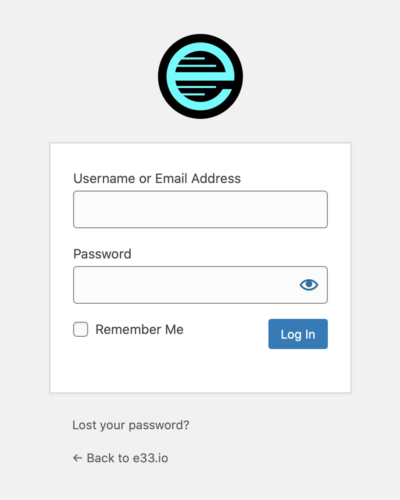
The default WordPress login page works perfectly fine, but it’s branded with their icon and the icon links to wordpress.org. Rebranding this page with your Site Icon helps make the login experience custom to your site. The method below uses the site_icon_url() for the background-image: url(), displaying your Site Icon in place of the WordPress icon, and links it to your site’s home page instead of wordpress.org.
Add this to the theme’s functions.php file.
<?php
function evo_login_icon() { ?>
	<style type="text/css">
		.login h1 a {
			background-image: url( <?php site_icon_url() ?> );
			background-size: contain;
			width: 90px;
			height: 90px;
			border-radius: 45px;
		}
	</style>
<?php }
add_action( 'login_head', 'evo_login_icon' );
function evo_login_url() {
	return '/';
}
add_filter( 'login_headerurl', 'evo_login_url' );
Now your Site Icon will display on the login screen and it will link to your site’s home page.
Adding a Mobile Menu in WordPress
Content on mobile screens can get cluttered quickly as multiple menu links are added for site navigation. A responsive mobile menu is great way to clean up the design and make the site navigation available on-demand. The possibilities for the layout and behavior are limitless, so for this site I wanted to keep it as minimalistic as possible to match the rest of the overall design. The method below is lightweight and can be easily modified.
First enqueue a new theme file in the functions.php file like this.
wp_enqueue_script( 'evo-menu-js', get_template_directory_uri() . '/js/mobile-menu.js', array( 'jquery' ), true );Then create a new file named mobile-menu.js with the JavaScript code below saved to it in the /js directory, inside the theme’s directory.
(function($) {
	$('#toggle').toggle(
		function() {
			$('#popout').animate({ left: 0 }, 'fast', function() {
				$('#toggle').html('<svg role="img" xmlns="http://www.w3.org/2000/svg" width="40px" height="40px" viewBox="0 0 24 24" stroke="var(--txt-color)" stroke-width="1.8" stroke-linecap="square" stroke-linejoin="miter" fill="none" color="var(--txt-color)" aria-label="close menu"><title>Close Menu</title><path d="M6.34314575 6.34314575L17.6568542 17.6568542M6.34314575 17.6568542L17.6568542 6.34314575"/></svg>');
			});
		},
		function() {
			$('#popout').animate({ left: -940 }, 'fast', function() {
				$('#toggle').html('<svg role="img" xmlns="http://www.w3.org/2000/svg" width="40px" height="40px" viewBox="0 0 24 24" stroke="var(--txt-color)" stroke-width="1.8" stroke-linecap="square" stroke-linejoin="miter" fill="none" color="var(--txt-color)" aria-label="menu"><title>Menu</title><path d="M6 7L18 7M6 12L18 12M6 17L18 17"/></svg>');
			});
		}
		);
})(jQuery);
Then update the existing menu navigation in the header.php file like this.
<nav id="menu"> /* <-- the existing nav#menu tag */
	<div id="toggle">
		<svg role="img" xmlns="http://www.w3.org/2000/svg" width="40px" height="40px" viewBox="0 0 24 24" stroke="var(--txt-color)" stroke-width="1.8" stroke-linecap="square" stroke-linejoin="miter" fill="none" color="var(--txt-color)" aria-label="menu"><title>Menu</title><path d="M6 7L18 7M6 12L18 12M6 17L18 17"/></svg>
	</div>
	<div id="popout">
		<?php wp_nav_menu( array( 'theme_location' => 'main-menu' ) ); ?> /* <-- the existing wp_nav_menu php */
	</div>
</nav>
Finally, add the CSS below to the theme’s existing stylesheet.
@media (min-width: 940px) {
	#toggle {
		display: none;
	}
}
@media (max-width: 939px) {
	#popout {
		background: var(--block-color);
		opacity: 0.97;
		z-index: 98;
		position: absolute;
		top: 0;
		left: -940px;
		width: 940px;
		max-width: 100%;
		overflow: hidden;
	}
	#toggle {
		float: right;
		z-index: 99;
		position: absolute;
		top: calc(10vw - 8px);
		right: calc(10vw - 8px);
	}
	#toggle:hover {
		cursor: pointer;
	}
	ul#menu-primary-menu.menu li {
		border-bottom: var(--std-brdr) solid var(--txt-color);
		margin-bottom: var(--std-brdr);
		padding: 10vw;
		width: 100%;
	}
	ul#menu-primary-menu.menu li a {
		text-decoration: none;
		width: 100%;
	}
}
Note that the method above uses inline SVG icons for the toggle buttons, and CSS variables like in this previous post. I’ve set the responsive breakpoint to 940px to match my theme’s layout (this should also include most tablets in portrait-orientation).